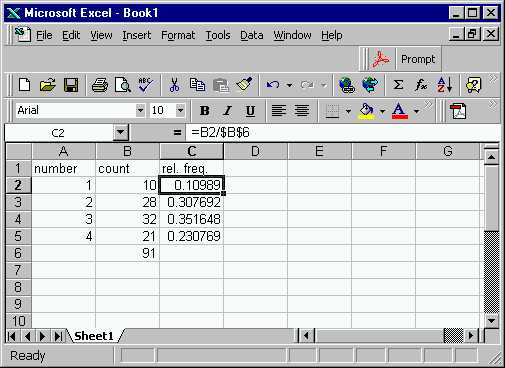
Recall how both "absolute" and "relative" cell indices work together to give a formula that can easily be dragged along to give all of the relative probabilities. If you forgot this, you may want to look again at Step 3 in Class Example 1.
This is a step by step solution, using Excel. It shows how to
draw bar graphs, using the data from the first day of class, where everyone
was asked to "choose a number from 1,2,3,4".
First the data were gathered, and typed into an Excel Spreadsheet.
Excel was also used to total the counts, and calculate the relative frequencies
(recall these are the counts divided by total counts). The result
looks like:
Recall how both "absolute" and "relative" cell indices work together
to give a formula that can easily be dragged along to give all of the relative
probabilities. If you forgot this, you may want to look again at
Step 3 in Class Example 1.
Now let's make both the "frequency" and "relative frequency" type bar
charts for these data. One way to get graphics into Excel is along
the menu path "Insert", "Chart" (there is a shortcut icon that may
appear somewhere on your screen), that pulls up a menu:
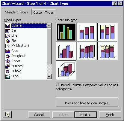
As you can see there is a lot of stuff
that you can do from here. The type of vertical bars that we are
using in Stat 23, come from the first choice "Column". So no extra
work needs to be done here.
Clicking on "Next" changes the window to:
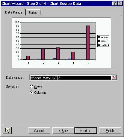
Note that Excel has made some (not all the good!) guesses about what
we want to see. In particular, it chose the full range of the everything
numerical in the entire spreadsheet. It did a pretty good job of
figuring out what we wanted as the "x" points, but it gave bars
showing
both the counts and the relative frequencies on the same
plot (not very useful). Furthermore it also thought we wanted to
see the total on the same plot, so note that it added an "x = 5"
part.
A look at the underlying spreadsheet show what the problem is.
The region in the moving dotted lines (which is the "Data range:"
in the above menu) is too big. We should trim it down to just the
part of the table we are interested in. Various methods for filling
in such data ranges were discussed in Class Example
1.
The next step is to tell Excel what we really want. You could
just type in the range that we want. Another approach is go back
to the original sheet, use the mouse to highlight the correct region.
Another possibility is to have the part of sheet you wanted highlighted
when you first call for the chart. In any case the result is:
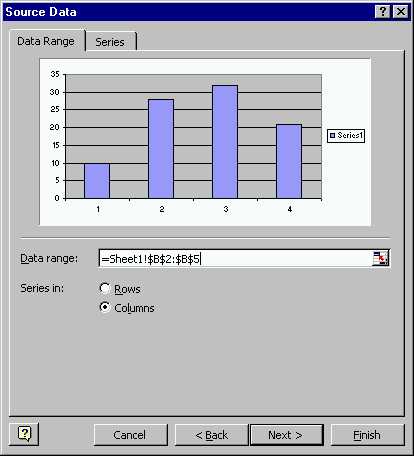
The "Series in:" radio buttons allow you to work with either rows or
columns of data.
Note that the menu is now showing you a decent looking bar graph.
But, there are many ways in which we may want to change it, including labeling.
Some of these are easily at the next stage of the operation. Click
"Next >" to get to something like:
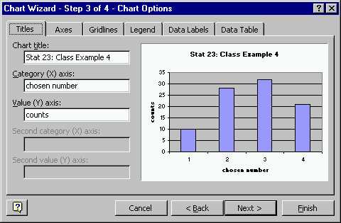
Note that I filled in some of the fields (e.g. "title") which will
add stuff to the graph (and in fact does it in the version that you see
on the menu). There are also lots of other things that you can fiddle,
on the other folder tabs that you can see on the menu. For example,
note that I already went to the one called "legend", and there I turned
off the little "series 1" box you can see in the menu above (that is only
useful when you have more than one type of bar, and want to show which
is which).
Click "Next >" to pull up the final menu:
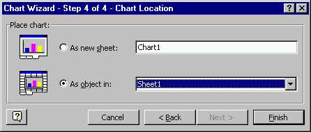
This let's you choose where the graphic should be put. "As a
new sheet" would be convenient if all I wanted to was to make a
print (e.g. as you often do on the homework), since it is very easy to
print a sheet. However, in this case, I want to keep everything together,
for posting on the web page, and thus it is better to keep it on the same
sheet as other parts of this problem.
Clicking "Finish" puts this onto the spread sheet, in a not very
nice way:
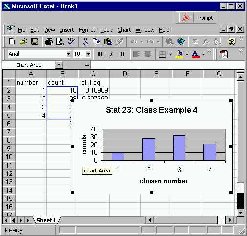
Note that part of the spreadsheet is covered up, and the "aspect ratio"
(ratio of height to width) is not very pleasing. These problems are
fixed by using the mouse to "pull on" the black boxes at edge of the graph,
to put it where you want, with the shape that you want.
Other properties of the graph can be adjusted by double clicking on
them. For example, the gray background can be removed by double clicking
there (which pulls up a menu controlling various things. The colors
can be changed by double clicking on the bars themselves. Here is
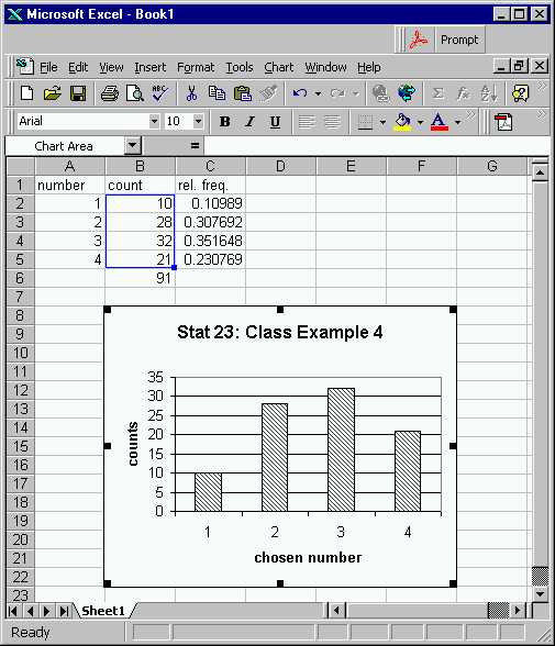
the result of twiddling several of these. Note I got rid of the colors,
since I am not using a fancy color printer. You should experiment
with some of these things by yourself.
Note that an additional advantage of having the graphic in the same
spreadsheet is that when it is highlighted (as here), the part of data
being plotted also gets highlighted. In computer programming terms,
these are "linked objects".
You might try using the third column of data to add a similar graphic
to the spreadsheet, which shows the "relative frequency" version of this
bar graph. Here is what I came up with for this:
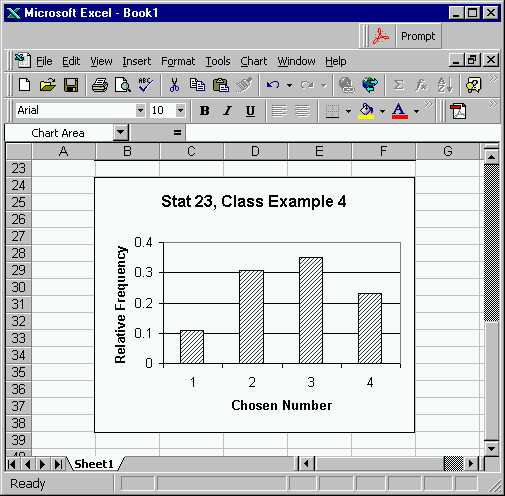
Note that as expected, this is basically the same as the above plot,
except the Y-axis is different. However, this required careful consideration
of the "resizing" that was done.
The final result of all the work done here is available on the spread
sheet version of this example.
Back to Stat 23 Home Page
Back to Marron's
Home Page