Class Notes: Thursday
8/29/02
Histograms:
Main Idea: a "curve" that "shows where the data are"
low where the data are sparse, high where the data are dense
E.g. "bell curves",
or "mound shaped curves", or "Normal curves"
Histogram: a "bar graph"
(i.e. simple) version of such a curve
Construction:
- split number line into "bins"
-
suppose "bin edges" (boundaries) are: ![]()
- Count data points falling into each bin
(recall data are ![]() )
)
-
I.e. define "bin counts" ![]() (for
(for ![]() )
)
-
Define "endpoint count" ![]()
- At upper end, Excel adds a bin labelled "more"
- Recommendation: Avoid endpoint hassles,
by choosing ![]() to include the data
to include the data
- Other ways of "handling endpoints" and "breaking ties" are possible
- Here use Excel convention (usually not a big deal)
[appears in Excel "Histogram tool", detailed here]
-
The ![]() are also sometimes called "bin frequencies"
are also sometimes called "bin frequencies"
- The bin counts, are low where data are sparse, and high where data are dense
-
So display ![]() as a "bar graph", to get "histogram"
as a "bar graph", to get "histogram"
What scale?
-
Could just show the ![]() themselves
themselves
- Problem: comparing two data sets with different sample sizes
(different overall heights give slippery comparison)
- Solution: make Total Area of histogram = 1
- Question: why "area", and not height?
-
Answer: Recall "human perception of objects focusses on areas
(not lengths)"
A recipe to make area = 1:
- For equally spaced bins, heights are proportional to counts
- Intuitive visual comparison of populations: "shifting around of areas"
- Number 1 is arbitrary, but fits well (in later courses) with "probability"
-
Implementation: take height of bars as: 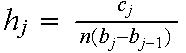
-
Reason: Area of bar = height x width = 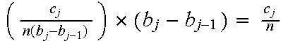
-
So: Total area = sum of bar areas = ![]()
-
Note: for bin edges at the integers, ![]() ,
,
so ![]() ,
,
a.k.a. the "bin proportion", or the "relative frequency"
- Drawback to Excel: this takes more work
(not the only point where Excel is "clunky")
Additional issues:
- Should there be gaps between bars? (Excel default)
Personal opinion: No, so histogram looks more like "smooth curve"
(smooth curve has most intuitive content)
-
How should the bin edges, ![]() ,
be chosen?
,
be chosen?
* A deep and challenging problem
* Much research has been done on this
* But no agreement on a "good" method
* Will return to this later
* Common simplifying assumption: equally spaced
* General good idea: try several binwidths
Example: Incomes Data
+ Slider allows user controlled choice of "binwidth"
+ An example of "interactive graphics"
+ Small binwidth is "too wiggly", obscuring useful structure
Since bincounts are too variable (driven by sampling variation)
+ Large binwidth is "oversmoothed", can miss important structure
Each bin count is an average over too large a region
+ Medium binwidth suggests "two modes"?!?
(here "mode" means a "bump", different from elementary definition)
+ This is strange in the income distribution world
(Since classical models all have only one mode)
+ Thus a major scientific discovery (if correct?!?)
+ How do we know they are "really there"?
(can have "many modes" or "none", depending on binwidth....)
+ PhD dissertation of H. P. Schmitz (Univ. Bonn) showed bumps are real
(found subpopulations of "pensioners" and "others")
+ But how can one know this during a first analysis?
(answer coming later)
Some comments on the visualization:
+ An Aside: note "actual movie" is hard to look at (too "jumpy")
+ But movie format, with sliders, provides useful visualization tool
allows "interaction" between viewer and graphic
Construction of histograms using Excel
Back to Statistics
6D Home Page