Class Notes: Tuesday
10/29/02
-
Check new material on student pages (from Class
Home Page)
Scatterplots:
Useful view of 2-dimensional data
Idea: for ordered
pairs of data values, (X, Y),
E.g. (height, weight),
(age, income), (size, price), (fuel
economy, horsepower)
Study relationship between
X & Y
Visual Device:
"scatterplot"
Plot points as:
X (on x-axis) and Y (on y-axis)
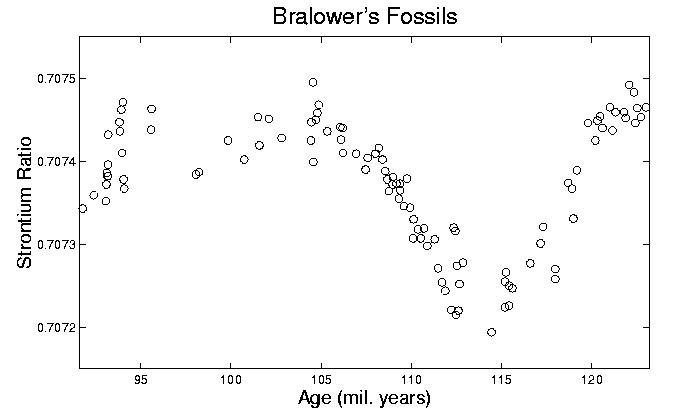
Example 1:
Data from Prof.
Tim Bralower, Dept. of Geological Sciences
Each data point represents one fossil shell,
- Dated by surrounding material (x-axis)
- Ratio of isotopes of strontium (y-axis)
- surrogate for "sea level"
- allows study of global climate (e.g. ice ages)
- obvious big changes
-
what about smaller changes???
Example 2:
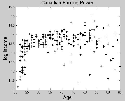
Data from Prof. Aman Ullah, Economics, Univ. Calif. Riverside
Shows how earning power (y-axis) depends on age (x-axis)
For 205 males in survey in Canada
- Youngest have little earning power
- But increases rapidly
- Eventually falls off
-
Variation increases over time
Example 3:

Trappings of Canadian Lynx
- A few very big years?
- More very small years?
-
Some type of cyclic structure?
Nicer scale??? (addresses "data compressed at bottom")
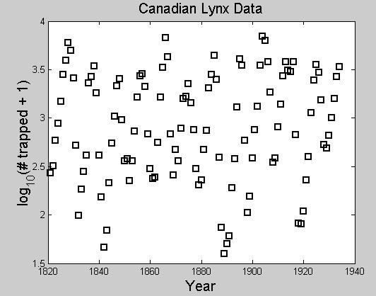
Still not easy to see "real
structure"
Another useful graphical device: connected lines
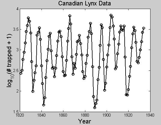
Note: this makes cyclical structure "pop out" in clear visual way
Explanation: related to food supply
- many lynx eat up most of food
- so lynx die off
- leads to more food
- leads to more lynx
-
cycle repeats
General issue:
Should scatterplots be "just dots", or "connected by lines"?
Depends on context:
- When there is "structure", connecting can highlight
- But is distracting when no structure
-
Should try both, and then choose
Scatterplots in Excel:
Toy Data Set: Old Faithful Geyser Data
1st Column: Duration of Eruption
2nd Column: Time before Eruptions
Expect Relationship?
Excel Scatterplot:
- Chart Wizard
- Chart Type XY (scatter)
- "Series Plot" is not interesting
- Instead Plot: X-values = time before Y-values = Duration
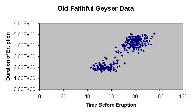
- Clearly shows "2 different types of eruptions"
-
With "big ones" coming after "big lead up time"
Caution: Don't use "line plot":
- Chart Wizard
- Chart Type Line
- Because this does some strange "reordering":

- Note numbers on x axis not in "correct order"
- instead appear to be in "list order"
- so cannot see interesting "2 cluster" structure in data
-
so stay away from this version of Chart Wizard for scatterplots
Instead use different subtype under "XY (scatter)"
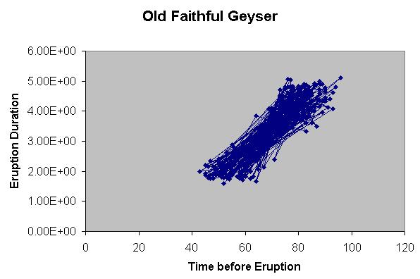
Note: in this case, connecting with lines clearly detracts from seeing "2 clusters"
Here is a case where "just
dots" is more useful
Scatterplots in Matlab:
- Use command >> plot(vx,vy,'+')
- Then fiddle other things as above
-
See "Matlab Graphics" in Computing
Tips
Back to Statistics
6D Home Page