Non-Fourier Analysis of Quasi-Periodic
Time Series
by J. S. Marron, R. Z. Li and C. A. Giuliani
Here some methods of studying time varying frequencies
in time series are given. The motivating data were provided by C.
A. Giuliani, of Allied Health Sciences, UNC.
Motivating Problem: Human Movement Data
Here is one trace of "tap" data, a record of the
movement of a person, while tapping a stylus on a pad as rapidly as possible.
Height is recorded as a function of time, with a resulting time series
as shown here:
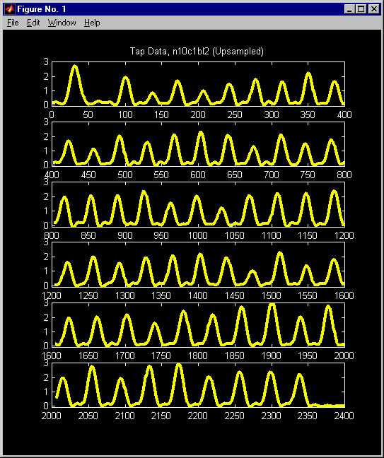
Because the sampling rate is not high with respect
to the features of interest, the data have been "augmented" by an upsampling
process, which consists of using part of the Fourier decomposition of the
series to generate data points at 4 times the original sampling rate.
This series has a very strong periodic component,
but both the height and the frequency change in time. Questions addressed
here are:
(i) How do we understand these changes?
(ii) Are the insights we gain "really there", meaning are the
observed phenomena statistically significantly different from the background
noise?
Approach 1: Classical Fourier Analysis
A simple Fourier approach to frequency modulation,
is to apply a triangular weight function to the Fourier representation
of the data, and then invert that transform. Then "low frequency
modulation" can be derived as the "envelope of the high frequency carrier".
While the approach is simple and appealing, a critical
assumption is that the carrier frequency has constant amplitude.
This is clearly not true for the signal above, so the signal needs to be
first adjusted to give nearly constant amplitude. This is done
as follows.
Start with the raw (not upsampled) data shown at
the top, and the periodogram (proportional to the "discrete power spectrum")
shown at the bottom: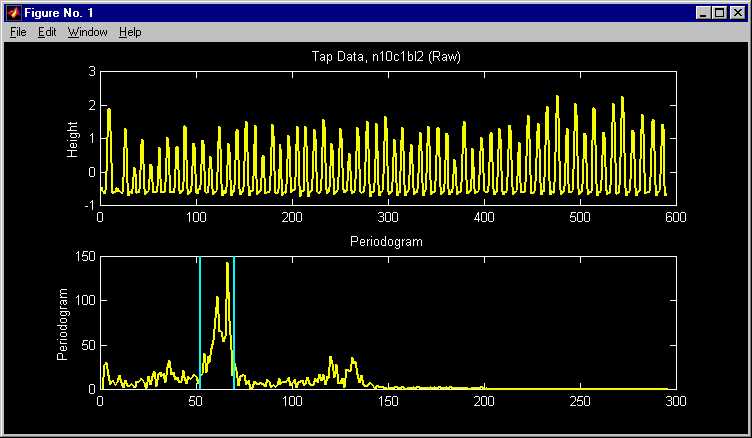
The strong periodicity in the data shows up as a marked peak in the
periodogram. Since the interesting periodicities occur near that
peak (and other components will affect the frequency modulation process),
reduce the data to only the Fourier components between the blue vertical
bars (these were chosen by eye).
The resulting and limited part of the data are shown
on the top of this picture, and a check on what was lost in the band limiting
process is provided by the residuals at the bottom:
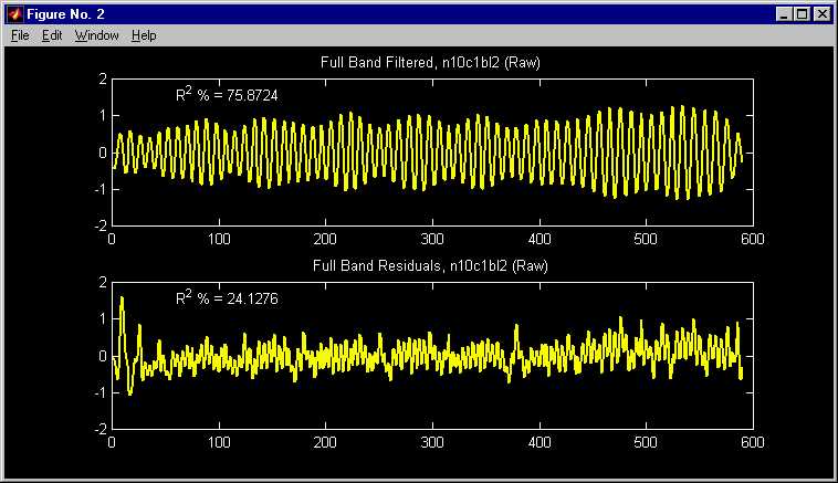
The residuals are visually smaller (note same axes), and do not appear
to have an interesting periodic component (at least visually). The
"R square" values show how the "power of the data" are allocated between
"power in this periodic component" =76% and "residual power"
= 24%.
The "envelope" of the Full Band Filtered data shows
the changes in magnitude. As noted above, to show changes in frequency,
a triangular weight function can be applied to the spectrum, but this requires
first removing the changing amplitude. This is done by obtaining
the envelope of the Full Band Filtered series, shown at the top, and then
dividing the series by the envelope, with the result shown at the bottom:
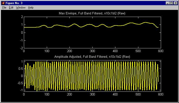
The envelope was obtained by finding the 0 crossing points of the first
differences, and taking the max of the series values on either side.
Then linear interpolation was done to "connect the dots". Some instabilities
in this were removed by using constant functions near each end.
Next, the periodogram of the Amplitude Adjusted,
Full Band Filtered series is multiplied by a triangular weight function.
The corresponding signal thus has "different frequencies shown as amplitudes",
as shown in the top. Another application of the max envelope operation
results in a curve whose height represents the "dominant frequency at that
time", shown at the bottom:
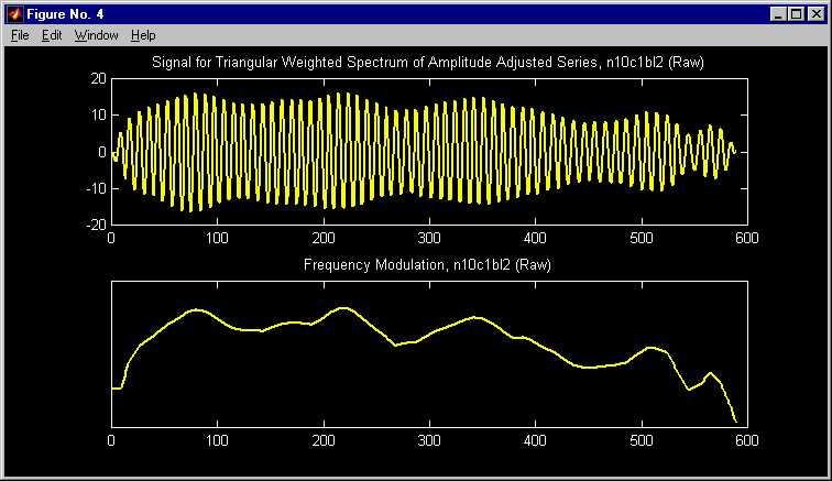
This shows several interesting features that fit with ideas in human
movement. The large scale features are a fairly rapid increase in
frequency early on, to a fairly high frequency steady state, followed by
a gradual decline. This fits with conventional movement ideas, as
the startup frequency is low, and is increased until a comfortable rhythm
is settled into. Later, as fatigue sets in, the frequency falls off.
A deeper question is the apparent smaller scale changes in frequency.
An explanation for these exists: to avoid fatigue from the repetitive
movement, one makes some rather minor changes in many components of the
movement, including body position, which have smaller impacts.
But are these small scale changes "really there"?
Or are they simply artifacts of the noise in the movement and measurement
processes, which has perhaps been magnified by the convoluted approach
taken to deriving this frequency curve? Another way to view this,
is can we somehow attach "statistical significance" to features seen in
the Frequency Modulation curve? I don't know of results of this type,
but if you do, please tell me: marron@stat.unc.edu.
If this has not been studied, then perhaps we are motivating some mathematical
statistical work in the field of Fourier analysis of time series.
But not wanting to take the time to do this ourselves, or to wait for others
to do it, we instead developed the following non-Fourier approach.
Approach 2: (Non-Fourier) Quasi Periodic Analysis
The main idea here can be understood by looking
at wagon wheels in old Western movies. They appear to move in strange
ways, e.g. often seeming to go backwards. If you look carefully,
you will see that the motion depends a lot on the speed of the wagon.
As the wagon is speeding up, the wheel can go from an apparent slow forward
motion, to apparently stopping, to apparently going backwards. Of
course this is a result of the movie being a succession of snapshots.
When the wagon wheel is going slightly slower than the movie sampling rate,
the wheel seems to go slowly backwards. When the speed reaches the
sampling rate, it appears motionless. As the speed exceeds the sampling
rate, it seems to go forwards. The key idea here is that a succession
of snapshots can provide a tool for understanding changing frequencies.
To apply this idea to a signal, such as the tap motion
trace at the top of the page, suppose the trace is on a strip of paper
which is moved past a shuttered window. The shutters are opened periodically,
at the "carrier frequency" (this is just what a movie camera does).
If the trace is a sine wave, whose frequency is the carrier frequency,
then the resulting movie shows a single arch of the sine function, and
it holds still. If the sine wave frequency is slightly lower than the carrier
frequency, then the arch of the sine wave moves to the left. If it
is slightly higher, then it moves off to the right. In the presence
of frequency modulation, the arch shifts location according to the frequency
at the time.
Here is a toy example to illustrate this principle.
(Caution: this is only a one frame screen shot
of the movie. Pushing the buttons on the image won't do anything.)
To see the movie, go here. (If your
computer doesn't immediately show this movie, some advice can be found
at: http://www.unc.edu/depts/statistics/faculty/marron/marron_movies.html
)
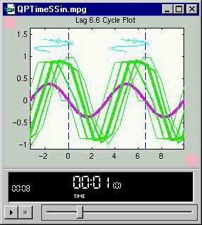
Again, to watch this as a movie, go here.
Some experimentation with toy examples, and with
real data, showed that the visual impression of frequency modulation could
be enhanced in several ways as shown here. First it is useful to
overlay not only the curve in the present frame, but also the two curves
before and the two curves after. To keep track of which curve is
which, the current frame gets a thick line type, and successively thinner
line types are used for the frames on each side. This gives a "fade
in, then fade out" effect when watching the movie, which is especially
helpful in the presence of noise. Second for easy viewing of interesting
phenomena near the edge of the picture, we found it helpful to highlight
the circular nature of this type of view (i.e. to "look beyond the boundary")
by showing half cycle periodic continuations of the picture, beyond the
boundaries (which are shown as vertical dashed lines). Thus, the
part of the picture to the left of 0 is just a replication of the part
just to left of the vertical dotted line at the boundary at 6.6, and similarly
on the right. Next, since the motion of the peak (which is showing
the important frequency modulation is not easy to remember, a light blue
trace of the location of the maximum in each frame is drawn, at the top
of the image. This trace is showing frequency as a function of time
(except that it is rotated 90 degrees from the way in which functions are
usually displayed).
The movie shows a fairly coarsely sampled sin wave,
whose frequency seems to change in time. The sinusoidal shape of
the light blue curve suggests a sinusoidal phase shift, which is equivalent
to a sinusoidal change in frequency. The trace was actually generated
by evaluating a sine function, with period 6.5, at an unequally spaced
grid of time points. The unequally spaced grid was chosen according
to the "time warping function" shown here:
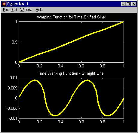
The warping function (actually a piecewise quadratic) looks very nearly
linear, but to accentuate its nonlinear character, its difference with
a line is shown in the lower panel. This difference reflects the
frequency modulation in the generated data trace, and also the light blue
curve in the movie.
This method is now applied to the real data trace (the
upsampled version, because its improved smoothness gives a better visual
impression) shown at the top of this page. Go here
to see the resulting movie. (Caution:
this is only a one frame screen shot of the movie. Pushing the buttons
on the image won't do anything.) {If this link doesn't start
a movie on your computer, see the note at the toy example movie above}
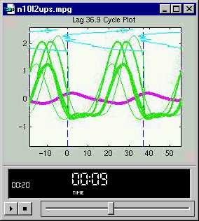
Again, go here to run the movie.
This movie shows both the changes in amplitude and
frequency that were observed from the Fourier analysis above. The
blue curve shows changes in frequency in a simple and direct sense.
The large scale frequency concepts are the same as found above: low
frequency at startup, followed by increasing frequency moving into a settled
rhythm, followed by lower frequency as fatigue sets in. The smaller
scale changes in the frequency are once again visually apparent (and the
motion in the movie seems suggestive of something like a change in body
position happening), but again it is not so clear whether these are "really
there" or not.
The advantage of this approach is that its simplicity
allows use of known methods in tackling the main problem, such as SiZer,
which is discussed in detail at http://www.stat.unc.edu/faculty/marron/DataAnalyses/SiZer_Intro.html
. A family of smooths of the light blue curve are shown in the top
panel, and the middle panel is the corresponding SiZer map. The SiZer
map suggests that the only statistically significant features are the overall
decrease (i.e. increase in frequency) at the beginning, and the overall
increase at the end. The "hesitancy" seen in the movie, around time
1100, shows up only as a purple non-significance. However, SiZer is relatively
weak at finding this type of structure, since this "hesitancy", and as
well as others, for example around times 500 and 2000, don't show up as
changes in the slope.
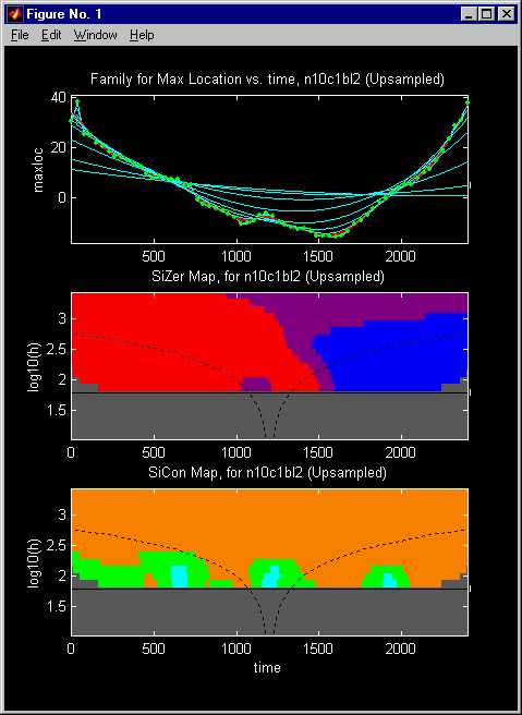
The bottom panel, shows a SiCon analysis of these data. This
works like SiZer, except that curvature, not slope is studied. Scale
space locations where the smooth is significantly concave are shaded cyan
(light blue), orange is used where the curve is significantly convex, and
green is used where there is no significant curvature. This is especially
useful in situations where there is a dominant slope, and it is desired
to find perturbations in that, as shown here.
The SiCon analysis does show that the "hesitancies",
around times 600, 1200 and 1900 (recall that these are quite visible in
the movies), are statistically significant, at the level alpha = 0.05.
This provides the first statistical confirmation that frequencies change
in this relatively "small scale" type of way. As noted above, this
is consistent with changes, such as changes of body position, that are
made to avoid fatigue.
An important weakness of this type of analysis is
that it requires a fairly coherent signal. Signals with a large amount
of noise, or whose frequencies do not change in a relatively smooth way,
may not give sensible answers (although pre-smoothing may help).
Another critical aspect of such analysis is the need
to finding a "carrier frequency". This can be done by trial and error
(which was done for the above movies). It can also be done using
Fourier Analysis, e.g. one could start with the Fourier peak that appears
between the blue bands in the above spectrum.
An alternative approach, which does not use Fourier
Analysis (and thus is not tied to sin and cos waves) is based
on searching through "seasonal effects" in the data. This is called
Visualization of PERiodicities. The idea is to study, for a range
of lags, l=1,...,k, how the "seasonal component of the series at
lag l", relates to the rest of the signal. This is done using
a "signal processing", i.e. "analysis of variance" viewpoint, but thinking
of the "proportion of the power of the signal that is explained at that
lag", i.e. the "sum of squares that is explained by the component at lag
l".
Here is an example of this type of analysis, using
the (raw version) of the tap location trace above. The top left panel
shows the raw data tap vertical location trace in yellow, and the sample
mean is shown as a magenta horizontal line. As in usual in ANOVA
considerations, the mean is removed before consideration of ratios of sums
of squares.
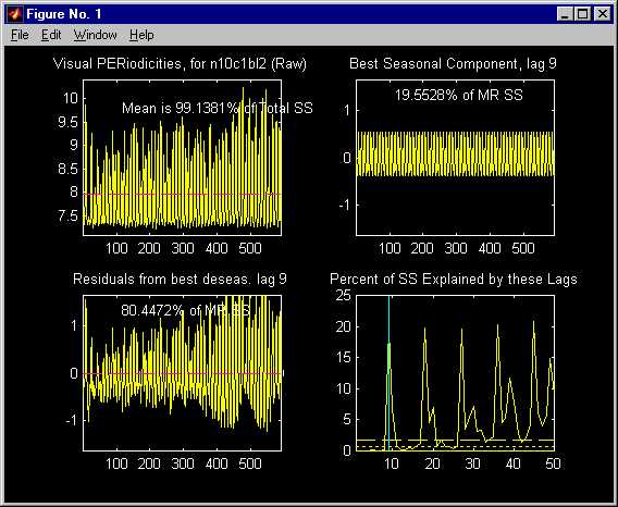
The lower right panel shows the percent of the total
(with the mean removed) sum of squares, that is represented by the seasonal
effects at lags l=1,...50. The first large one occurs at lag
l = 9, and note that at all succeeding multiples of 9, the
peak is at least this large (since the power of this seasonal effect is
also found for all later seasonal effects, at lags l = 9j).
For this same reason, there is a smaller "side peak", that is apparent
at lags l = 10, 20, 30, 40,... This suggests power in the
signal at frequencies between 9 and 10. To choose the "dominant peak",
it is not enough to just take the biggest one, because of this "additive
effect". To find the one that is "relatively largest", we use standard
F statistic theory, and take the peak whose F statistic is
"most significant" in the usual sense. The result in this case is
highlighted with the light blue vertical line, at lag l = 9.
The upper right panel shows this seasonal component,
and also shows that the percent of the power in the signal (after the mean
is subtracted) is about 20% (the peak looks shorter in the lower right
panel because of the imprecision of the graphics). The vertical scale
is the same as that of the raw data, to give a visual impression of what
"20% of the power" means.
Additional insight comes from looking at the residuals,
after the lag l = 9 seasonal component is subtracted. These
are shown in the plot on the lower left. Again the same visual scale
is used to allow simple viewing of this and the seasonal components as
a decomposition of the data trace. Note that substantial "periodic
structure" seems to remain in the data, which is quite consistent with
a changing frequency (as shown above).
It is tempting to try to find additional periodicity
in the residual trace on the lower left above, by the same method.
Here is the result:
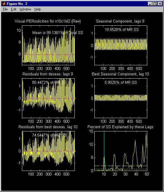
The top row is the same as above. The center left panel is same
as the lower left panel above, and is the starting point of this analysis.
Again, all lags l = 1,...,50 are considered
in the lower right panel. This time the lag l = 10 shows up
as the strongest (highlighted as the light blue vertical line). The
power of this seasonal component is only about 6% of the total, which fits
the fact that it looks much smaller.
The seasonal component at lag l = 10 is shown
in the center right panel (again using the same vertical scale as elsewhere,
for visual comparison).
The residuals from subtraction of this additional
lag l = 10 seasonal component are shown in the lower left.
Because the seasonal component is small, these residuals look similar to
the ones immediately above. This shows that the apparent periodicity
is not a "pure periodicity", which again suggests the apparent periodicity
has some shifts of frequency. A natural next step in such an analysis
would be to try the movies, of the type used above, to see if the changes
in frequency can be tracked over time.
Note: this type of analysis assumes that all "trend" has
been removed from the time series. Otherwise, the trend will seriously
affect the lagged components.
For more about this type of analysis, inquire by
email from marron@stat.unc.edu.
Back to Data Analysis Table of Contents
Back to Marron's
Home Page