Note that the structure of the data is made visually accessible by the family of smooths.
(This page is under construction.)
This page shows a set of examples (real data, and also simulated), showing
SiZer in action. These assume a working knowledge of SiZer, which
can be obtained from the SiZer
Basics Page.
The examples are:
2. SiZer analysis of Flow Cytometry Data
3. SiZer in gene micro-array analysis, the print tip problem
4. SiZer in software engineering
5. SiZer analysis of internet traffic data
6. SiZer analysis of the Mollusk Data
7. An "on-line" version of SiZer for financial data
8. SiZer analysis of the Dust Data
9. Data rounding in the Hidalgo Stamp Data
10. SiZer analysis of the Draft Lottery Data
11. SiZer analysis of the Chondrite Data
13. Simulation: increasing sigma
14. Simulation: simultaneous inference
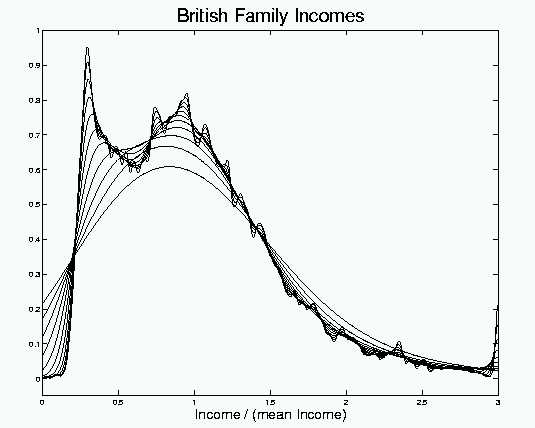
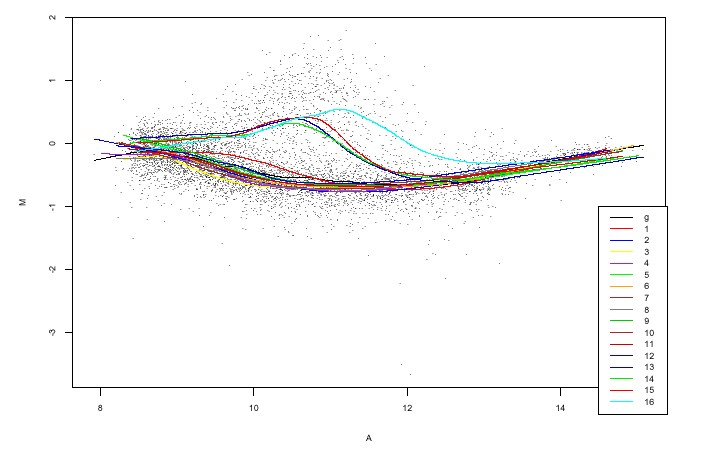
This example features the British Incomes Data. See Schmitz and Marron (1992) Econometric Theory, 8, 476-488 for a detailed discussion of the data. They are survey data of Household Incomes in Great Britain, for the year 1975.
The potentially poor performance of a histogram analysis of these data is demonstrated near the end of Section 1 of the SiZer Basics Page. It is seen there that a smoothed version is preferable, e.g. from the binshift movie.
A key idea from the SiZer Basics Page is that useful information is often available from a number of different smooths of the data (i.e. different "levels of resolution"). In Section 4, an overlay of the entire family of smooths is recommended. Here is the family of Gaussian kernel density estimates for the British Family Incomes data:
Note that the structure of the data is made visually accessible by
the family of smooths.
At the smallest scales (small bandwidth, i.e. undersmoothing), there are many bumps and wiggles. Perhaps most experienced data analysts would interpret those as "natural sampling variability". But how can the experts be sure, and what about non-experts?
At medium scales, there appear to be two strong modes. If these are "really there", as opposed to being sampling artifacts, then they represent an important finding, because income distributions are expected to be unimodal (and all of the standard parametric models reflect this structure).
But substantial doubt about the case for bimodality is also present in this plot, because at larger scales (coarser levels of resolution), the 2 bumps are smoothed into just one. Again the experienced data analyst will recognize this as the expected oversmoothing, but there remains a question as to "where to draw the line?". For non-experts the problem becomes critical. It is very easy to either miss important underlying structure (viewing it as a mere sampling artifact), or to mistakenly interpret spurious noise as important underlying structure.
For the income data, as noted near the beginning of the SiZer Main Page, this issue was resolved by careful and detailed analysis in the PhD dissertation of Heinz-Peter Schmitz (where some really interesting time changing structure was also revealed). But in most exploratory data analyses that level of human effort is usually not available.
How can the time pressed data analyst decide when structure is "really there" (and thus well worth deeper confirmation, and investigation into underlying causes), or is "a spurious sample artifact" (and thus would be a waste of the valuable human resources that would be required by a deeper investigation)?
SiZer, developed in detail in Section 5 of the SiZer Basics Page, is a statistical inference tool which both speeds this decision process for experts, and also makes it safe and effective for non-experts. Here is the SiZer analysis of the Incomes Data:
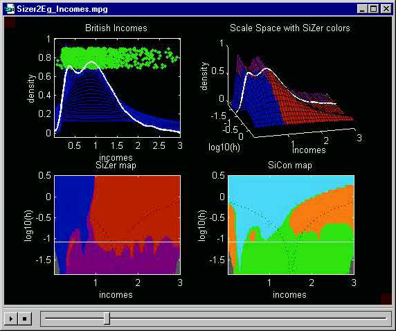
Here a medium level of smoothing has been highlighted. The white
line passing through blue - red
- blue - red
regions in the SiZer map demonstrates that both major modes are "really
there", i.e. cannot be explained by spurious sampling variability.
Had SiZer been used in the orignal analysis of these data, it would have
shown at a very preliminary stage that the confirmation, and explanation,
of the bimodal struture done by Heinz-Peter Schmitz would yield an interesting
result.
This also shows why the "map" visualization in the lower left is preferred to the "colored surface" visualization in the upper right: the first red region disappears behind the crest in this view of the surface.
The SiCon map (lower left) does not show much significant curvature at this level of resolution. As noted in Section A, this is because the second derivative estimate (on which SiCon is based) is more strongly affected by sampling variability, than the first derivative estimate underlying SiZer. A somewhat coarser level of resolution (larger bandwidth) is needed to find significant curvature.

The SiCon map now provides a somewhat different confirmation of the
bimodal structure, because the white line passes through orange
- cyan - orange
- cyan - orange
regions, indicating convexity - concavity
- convexity - concavity
- convexity. Note that the highlighted
smooth in the upper right now is actually unimodal. This highlights
the fact that SiCon is focussing on curvature, not modality.
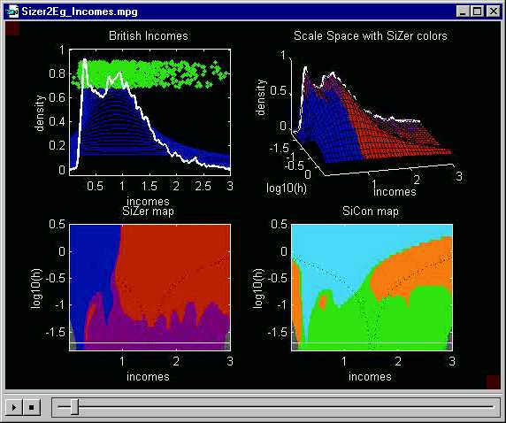
Here is a fine scale view. The highlighted kernel density estimate,
in the upper left, is very wiggly. Smoothing experts recognize this
as undersmoothed, with spurious sampling artifacts driving the structure.
SiZer confirms this because the white line in the lower left SiZer map
runs almost completely through purple regions.
The one exception is the blue near the left
end, indicating the the initial steep slope is still statistically significant.
Similarly SiCon indicates with the large green
region that there is no significant curvature.
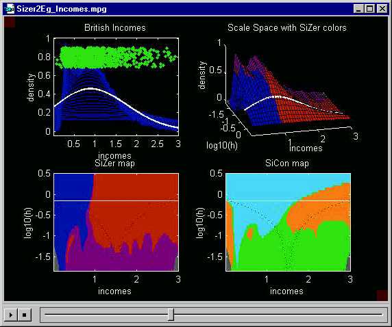
Here is a coarse scale view. At this level of resolution of the
data, SiZer shows only a single mode, which is significant, and SiCon shows
only concavity, followed by convexity.
As indicated in Section A, no choice needs to be made between these views of the data, but instead all contain useful information. The answer to the question "are there two modes here, or perhaps only one?" is: at medium levels of resolution (top plot) there are two significant modes, and at coarser levels there is only one. Since the two modes exist at some level, they are worth deeper investigation.
Also as indicated in Section A, an important point is that all of the information in the data is immediately available in this one simple graphic. In particular, it is quite clear that the bimodal structure is "real" (using either SiZer or SiCon), and thus that effort to investigate and explain this surprising structure would be justified.
The movie version of this SiZer analysis (which allows choice of the
highlighted level of smoothing) is available here.
The data analysed here come from the laboratory of Drs Steven Mentzer and James Rawn, Brigham and Womens Hospital, Boston, Massachusetts. Special thanks are due to Matt Wand for putting us in contact.
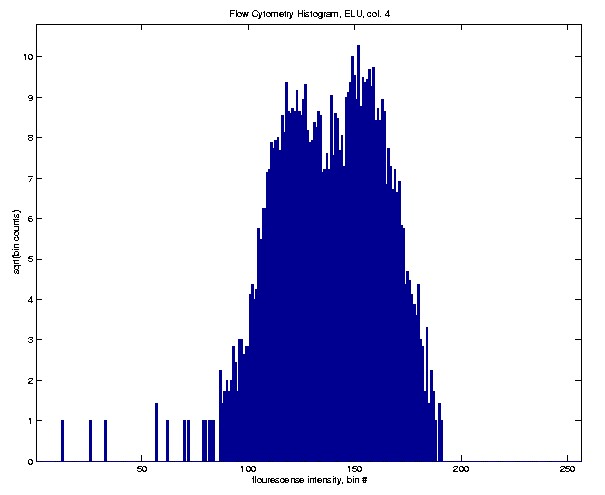
Flow cytometry studies the presence and percentage of flouresence marked antibodies on cells. The medical goal is the determination of quantities such as the percentage of lymphocytes among cells.
In a single experiment, many cells are run past a laser, and the intensity
of flourescense is measured. Here is a 256 bin square root histogram
of intensities, from one such experiment, for 5000 such cells.
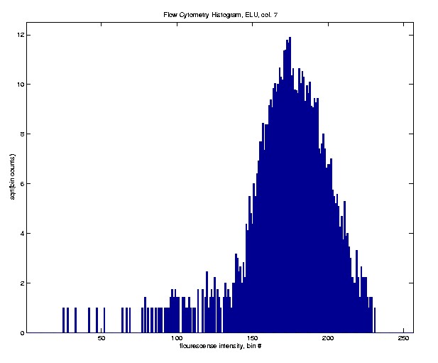
In this case the histogram looks nearly Gaussian. This is expected
to happen when the cells are of the same type, and the marked antibodies
have a nearly uniform distribution on the cell surfaces.
Here is a much different case.
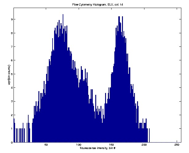
This histogram clearly shows a mixture of two quite separate Gaussian
distributions. This happens when there are two different subpopulations
of cells, with markedly differing degrees of attraction for the marked
antibodies.
The above histograms represent extreme cases, and a full range of "in
between" cases also come up, such as this one.
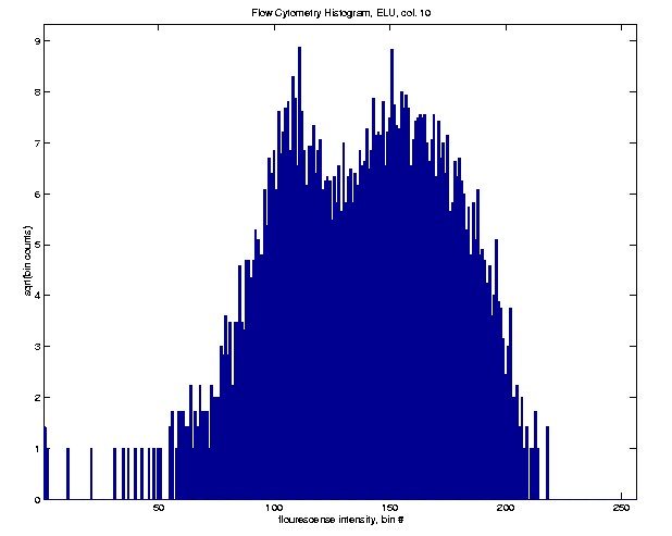
This histogram seems to suggest a bimodal mixture, but it is not so
clear cut, because the difference between the two peaks and valleys is
only of the same order of magnitude as the sampling variability (as visually
represented by the fine scale peaks and valleys).
SiZer is a useful tool for addressing questions of this type.
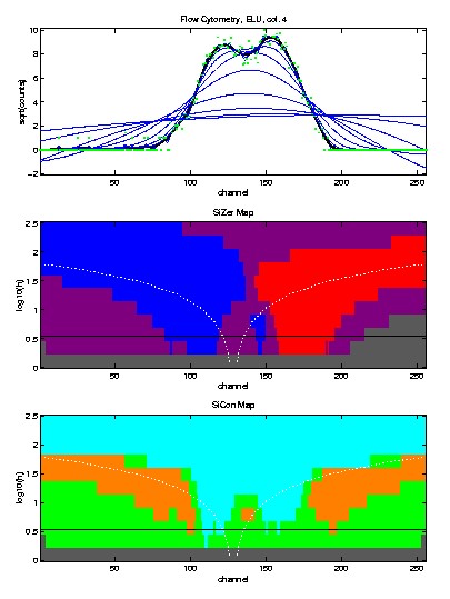
Here is SiZer analysis of this data set.
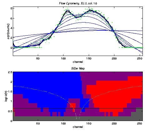
The green dots at the top are the same as the heights in the above
histogram (i.e. square roots of the bin counts). The top plot contains
a family of local linear smooths of the green dots, with the bandwidth
chosen by the Ruppert - Sheather - Wand data driven method highlighted.
The bottom shows the corresponding SiZer map. The blue
- red - blue
- red pattern in the SiZer map shows that
both modes are statistically significant in this case.
A closely related example (just a different data set), that illustrates
a different point, is the following.
Again there is a suggestion of bimodality, but it is not completely
clear. Hence the SiZer analysis should be useful in determining whether
there is strong evidence for two subpopulations.
This time the SiZer analysis nearly finds too modes, but not quite.
The reason that SiZer falls short of finding both modes is that there
is no red on the right side of the left hand
mode. This is a case where SiCon (recall this is based on statistical
significance of convexity, not slope) works when SiZer doesn't. In
particular, the pattern orange - cyan
- orange - cyan
- orange shows that both peaks are "really
there", in the sense the there are two regions where there is significant
concavity (the peaks), and there is significant convexity in the valley
between.
An important observation that follows from this analysis, is that both
SiZer and SiCon are separately useful for data analysis. They each
have the capability to detect statistically significant "features" that
the other can miss (i.e. doesn't have the power to detect).
The data analyzed here came from Sandrine Dudoit and Matthew Callow. Special thanks are due to Molly Megraw for pointing out this potential SiZer application.
This analysis is a followup on part of that in Dudoit, Yang, Callow and Speed (2000) "Statistical methods for identifying differentially expressed genes in replicated cDNA microarray experiments", Technical Report #578, available at the web address http://www.stat.berkeley.edu/users/terry/zarray/TechReport/578.pdf.
Part of that paper addressed the issue of calibrating differential gene expression data, gathered from microarrays. They used smoothing methods to make clear that there were some systematic inconsistencies in the "background expression" that were caused by "print tip effects" inherent to the physical construction of the microarrays.
A key part of this analysis is the graphic shown here, reproduced from
their Figure 4.
The 16 colored smooths represent trends characteristic to the 16 print
tips. Note that the first 12 appear to have a quite different shape
from that of the last 4. In particular the first 12 only appear to
decrease, then increase, while the last 4 seem to increase, then decrease,
then increase again.
Is this structure "really there", or could it be just artifacts of the sampling variability? The raw data, indicated by the small black dots, show that the level of noise in the data is rather high, so the issue is not obvious. However, the fact that all of the first 12 are similar, as are all of the last 4 strongly suggests this change is systematic, which was the conclusion of Dudoit, et. al.
But suppose only two curves, one of the first type, and one of the second, were available. Would it then be safe to conclude that the structure was different (and there was a systematic print tip effect)? Here some SiZer analyses are very useful.
Here is a SiZer analysis for print tip 6. The corresponding analyses
for the other tips in the first group of 12 were quite similar.
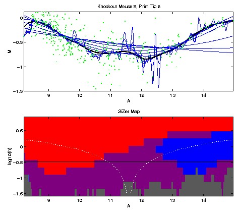
The SiZer colors show that the decreasing trend on the left side, and
the increasing trend on the right side, are both statistically significant,
and those are the only significant structures.
Here is the corresponding analysis for print tip 14.
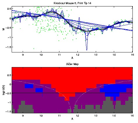
This time SiZer reveals the quite different shape of increase, then
decrease, and another increase. Note that the latter increase is
not obvious, because the data are quite sparse in that region.
Thus SiZer allows concluding that the second print tip has a much different
bias from the first.
These data were kindly provided by Matthew Campbell, of the UNC Department of Geology. The data are fossil shells of a variety of mollusks, that have been dated by the location at which they have been found. Each genus has been found at some time periods, but not at others. The last time period that a genus was found is called the time of extinction. The "rate of extinction" is arrived at by smoothing a series where each genus is represented as a time series with a 1 at the time of extinction, and a 0 elsewhere.
Here is a preliminary SiZer analysis:
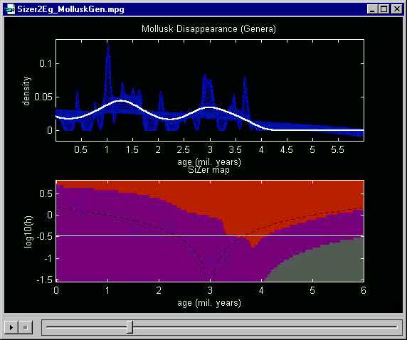
The highlighted smooth suggests that there were two periods with a
very high extinction rate. This is consistent with known major climatic
changes during those time periods.
But the SiZer analysis is unfortunately negative. At this level of smoothing, only the decrease around 3.5 million years ago is statistically significant, and the other structures cannot be distinguished from the natural sampling variability.
One view of the problem here is that the data are unfortunately too sparse to show conclusively that there were two periods of mass extinction. In some situations it makes sense to gather more data (e.g. in experimental situations a larger experiment can be run). However, this is impossible here, as the fossil shells have been collected over a period of much more than 100 years.
But fortunately there is another way to "find more data". That
is to study a finer classification of the shells, into species, not just
genera. Here is the same analysis applied to the species classification
of the mollusk data:
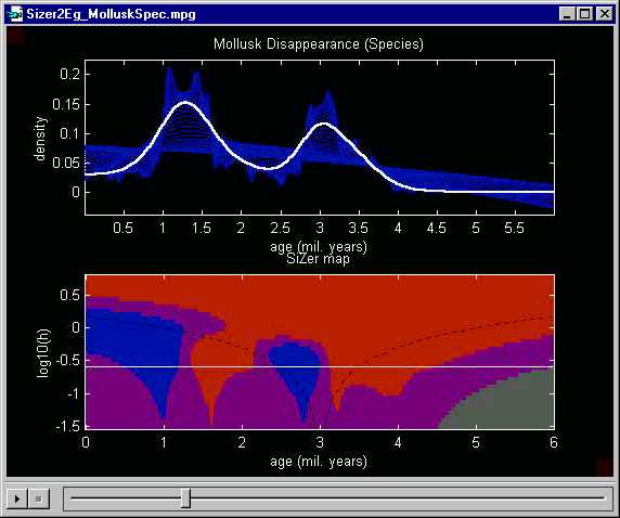
Once again the two major peaks, representing periods of mass extinction,
are quite prominent in the highlighted smooth. But this time the
SiZer analysis shows that both peaks are statistically significant, because
the white line goes through regions colored blue
- red - blue
- red. Had the major climatic changes
during these time periods not been known, this SiZer analysis suggests
that investigation into such possible causes would be worthwhile.
A caveat of this analysis is that a key assumption of SiZer is independence. This is violated here, because the time of extinction of species in the same genus are expected to be related. A careful analysis of these data should take this issue into account.
The full movie versions are available here: genus
analysis, species analysis.
For more about SiZer, inquire by email from marron@stat.unc.edu.
Back to SiZer Main Page
Back to Data Analysis Table of Contents
Back to Marron's Home Page