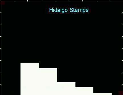
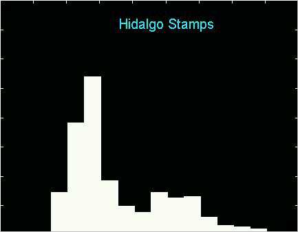
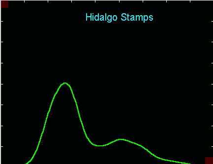
Most people would call this "oversmoothed" (important structure is "smoothed away" by a too large binwidth). This histogram only seems to suggest a right skewed unimodal distribution.
This page gives background material in statistical smoothing and an introduction to SiZer.
The main sections are:
1. Histograms are "smoothers",
but here is why you shouldn't use them.
2. Kernel Density Estimation,
a "smoothed histogram", and the importance of the bandwidth.
3. An introduction to scatterplot
smoothing, i.e. nonparametric regression,
a useful way to find structure in data, and again the importance of
the bandwidth.
4. The family approach to smoothing,
look at all members of the family of smooths, i.e. all the bandwidths,
instead of attempting to choose a "best" one.
by J. S. Marron and S. S. Chung
5. SiZer,
Introduction to the basic ideas.
The main points are illustrated by the Hidalgo Stamps Data, brought to the statistical literature by Izenman and Sommer, (1988), Journal of the American Statistical Association, 83, 941-953. They are thicknesses of a type of postage stamp that was printed over a long period of time in Mexico during the 19th century. The thicknesses are quite variable, and the idea is to gain insights about the number of different factories that were producing the paper for this stamp over time, by finding clusters in the thicknesses.
Here are some histograms of these data for various window widths:
Most people would call this "oversmoothed" (important structure is
"smoothed away" by a too large binwidth). This histogram only seems
to suggest a right skewed unimodal distribution.
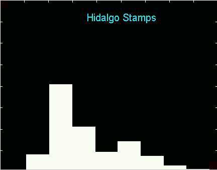
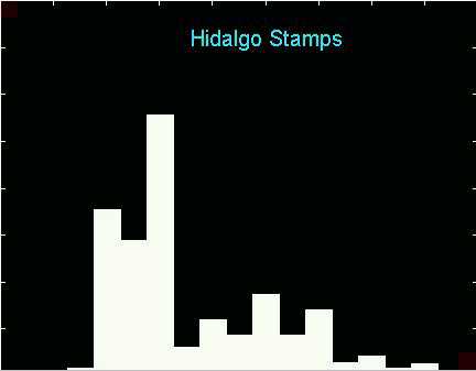
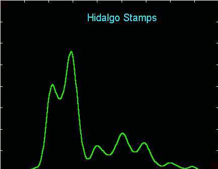
This binwidth is only a little smaller, but now there appear to be
perhaps two modes.
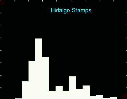
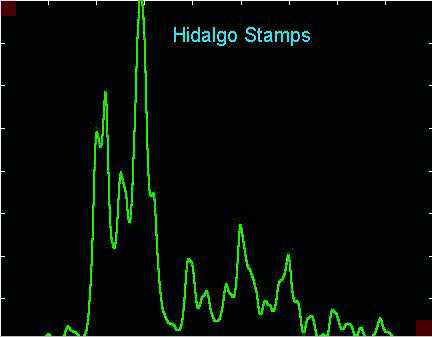
Here is a smaller binwidth which suggests quite a few modes.
Maybe 6? How many are "really there" (vs. being "sampling artifacts")???
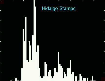
And this really small binwidth shows lots of structure that seems to
be spurious sampling variability.
If you would like to play with the window width yourself (i.e. explore
more than just the three shown above), take a look at this movie.
It is hard to look at if you run it as a movie, so instead you should stop
it, and then manipulate the slider on your movie player, which allows you
to choose the particular movie frame, i.e. the binwidth of the histogram.
All of the above are simply screen shots made from this.
The above illustrates the "binwidth" problem that most people understand: the user must choose the amount of smoothing. A less widely understood problem is that of "bin location", i.e. what is the "origin" or the "anchor position" of the bin grid. This is illustrated by the following, which all use the same bin width, but show different "shifts of the bin grid" (for the stamps data):
This one uses a binwidth very similar to the 3rd plot above, suggesting
the existence of perhaps 7 modes (i.e. factories producing the paper for
the Hidalgo stamp)?
But this one uses the same binwidth, and
is only a "rigid shift" of the bin grid (by a perhaps surprisingly small
amount). So the histogram based suggestion now is for only 2 (or 3?) modes?
Again, if you would like to explore more of these shifts yourself, look
at this
movie.
This time it is more fun to watch it actually as a movie. It is perhaps
surprising how "discontinuously" the changes occur. This phenomenon
is caused by heavy "rounding" in the Hidalgo Stamps Data (only two significant
digits are recorded), with major changes occurring when several of these
discrete rounding locations simultaneously cross over a histogram bin edge.
To understand what is happening with this shift, here is an overlay
of the same histograms, with a "smooth version of the histogram", shown
in green:
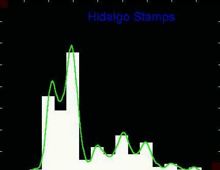
Here is the 7 modal bin location. Note that the peaks of the
seven modes line up very well with the peaks of the smooth
version.
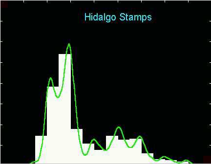
Here is the 2 modal version. The modes apparent in the above
histogram disappear because (for this bin location) now the peaks of the
smooth
version are clearly separated between adjacent bins.
Once more, you might agree that it is fun to look at the full movie version, of these bin-shifted histograms together with the smooth version.
This insightful smoothed version of the histogram, can be thought of as "the average of all of the histograms in the movie". This is not exactly true, for technical reasons discussed in Section 2 below. But the green curve and the true average of the histograms are both "Kernel Density Estimates". Kernel Density Estimation is introduced from another viewpoint, and discussed in detail in Section 2 below.
The major lesson of this section in that the histogram as a tool for
finding modes in data can be quite dangerous. Unless care is taken,
important features in the data can easily be missed by arbitrary choice
of either the binwidth, or the bin location. The issue
of binwidth is the harder problem, and is dealt with below in Section
4. As seen above, the issue of bin location can also be critical,
however it has been very well known in the statistical smoothing community
for a long time that the problem is simply and directly solved by using
smoothed
versions of histograms:
Since the smooth version
shows clearly what is happening in the data, it should replace the histogram
as the fundamental tool of exploratory data analysis.
While this idea has been clear to a community of specialists for some time, why has it been slow to catch on in general (e.g. to permeate statistical software packages)? Here are two strong reasons, and two recent developments for addressing each of them:
1. The smooth version still has a "bin-width" that needs to be chosen (see Section 2 below for details and commentary on this issue). A time honored approach to this problem in the context of exploratory data analysis is for an expert to study a number of smooths. An overlay of such smooths has been more recently labeled the "family approach to smoothing", and is discussed in Section 4.
2 The smooth version makes
the central data analytic problem of "which features in the data are really
there?" more apparent to the user. The SiZer method, introduced in
Section 5, provides a solution to this problem.
The above shows just one example of the binwidth and bin location problems of histograms. A natural question is "just how prevalent are these problems?"
This question is addressed through the study of two subquestions, and their answers:
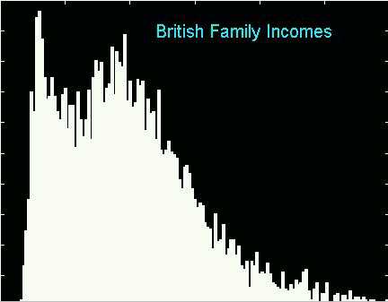
i. How many data sets have such problems? The Hidalgo Stamps data were deliberately chosen because the problems are unusually bad. In particular, so many modes appear and disappear only because the peaks apparent in the smoothed versions are approximately equally spaced. If the peaks were more "randomly spaced", then by shifting the bin grid, these peaks would be appearing and disappearing, but this would not be happening in this simultaneous way. However, missing even one important peak can mean leaving a scientific stone unturned. Furthermore, it seems that most (multimodal) data sets allow a least one peak to disappear, by bin shift alone (there might be an interesting theorem here). This point is illustrated with the British Incomes Data below.
ii. For which binwidths and bin locations will we have such problems? Here is where the answer seems to be "not all that often". Indeed very careful choice of the binwidth seems needed to make the "bin shifting" problem occur. Furthermore, there is a choice for which this particular problem can be made to disappear: gross undersmoothing. To see this, let's revisit the undersmoothed histogram of the Hidalgo Stamps data:
Note that after doing some "visual smoothing", the 7 modes suggested
above can all be found. But the really hard problem is distinguishing
them from other possible choices and "background noise". This is
where statistical inference of the type made available by SiZer (introduced
in Section 5 below) becomes crucial to
effective data analysis.
Now, to underscore the point that bin shifting problems can be made to occur for most (multimodal) data sets, the rest of this section contains a similar set of plots for the British Incomes Data. See Schmitz and Marron (1992) Econometric Theory, 8, 476-488 for a detailed discussion of the data. They are survey data of Household Incomes in Great Britain, for the year 1975.
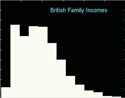
Here is a choice of bin location that accentuates the bimodality.
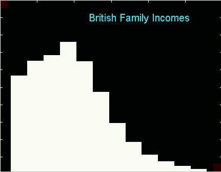
And here is the result of a bin shift only (same binwidth), in which
the modes completely disappear.
To see more of these, look at the full movie
version (again it is fun to watch as a movie).
As for the Hidalgo Stamp data above, this phenomenon is clearly understood
by an overlay with a smoothed version:
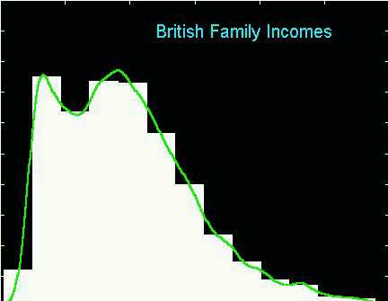
Here is the bimodal bin shift. Note that the first peak is centered
in a single bin, so it is clearly resolved by the histogram.
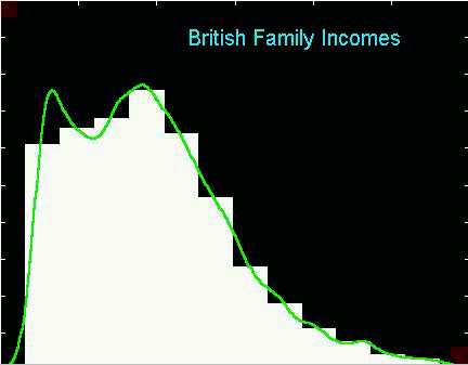
And here is the unimodal shift. In contrast here, the first peak
is split between two bins, so it disappears.
It it also fun to view the full movie
version from which these were extracted.
As noted above, this "bin location drives modality" phenomenon happens only for a rather carefully chosen binwidth. To try other bin-widths for these data, you may wish to view this movie. It is recommended that this be viewed statically, using the movie player's slider to control the binwidth.
Here is one screen shot from that movie, that reiterates the above
point that if you must use a histogram for data analysis, it is better
to under smooth, and allow the eye of the data analyst to do "visual smoothing"
as needed to see the structure in the data.
There are a number of good books available on kernel density estimation, most of which are highly recommended. There has also been some rather unfortunate history of controversy between authors of these books (including several unfortunately slanted book reviews). In my opinion, almost all of these books have particular strong and worthwhile aspects. Not everybody agrees with this, perhaps because some flexibility in terms of perspective is needed to see it.
Kernel density estimation could be motivated as the green smoothed histograms shown in Section 1 above, via an "average of shifted histograms". But a perhaps more insightful graphical motivation is the following, illustrated with the Chondrite data, brought to the statistical literature by Good and Gaskins (1980) Journal of the American Statistical Association, 75, 42-73.. A Chondrite is a meteor that survives the process of entering the earth's atmosphere, so that we still have some rock. Much is currently known about the sources of meteorites, but at one point a fundamental question was: from how may different sources do these chondrites originate? A useful variable was the percent of silica in the Chondrites, and the 22 values in the data set are shown here:
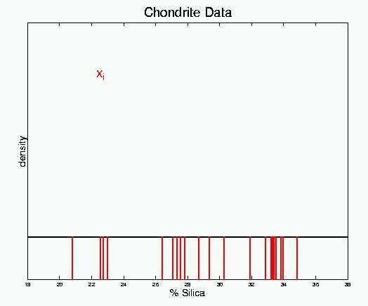
Here each of the 22 numbers is represented as a vertical red bar, that
shows "position on the number line". A more standard display would
represent each number by an "x". From this display (as from attempting
to just study a listing of the numbers), it is not easy to see "structure"
such as modes in the data. Kernel density estimation solves this
problem.
One way of viewing kernel density estimation is to consider the data
to be a random sample from some underlying smooth probability density,
and then to use the data to try to recover the density. An intuitive
approach to this problem is to assign probability mass 1/n
to each data point, and to "smear the mass out a bit" (since it was only
by chance that the data point ended up precisely where it did). This
concept is demonstrated for the Chondrite data in:
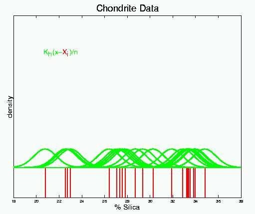
Now each vertical red bar has a green blop of probability mass centered
over it. Near the top is the mathematical representation.
The symbol K denotes the "kernel function", and it determines the "shape" of the assigned mass. In this case K is the Gaussian (Standard Normal) probability density. Note that subtraction by each data point shifts the mean of the small densities, so that each is centered over their respective data points.
The symbol h is the "bandwidth", and controls the "spread" of the assigned mass. For the Gaussian kernel, h is the standard deviation of the green Gaussian densities.
These green kernel functions still don't do much to highlight modal
structure in the data, but such structure is brought out by summing them:
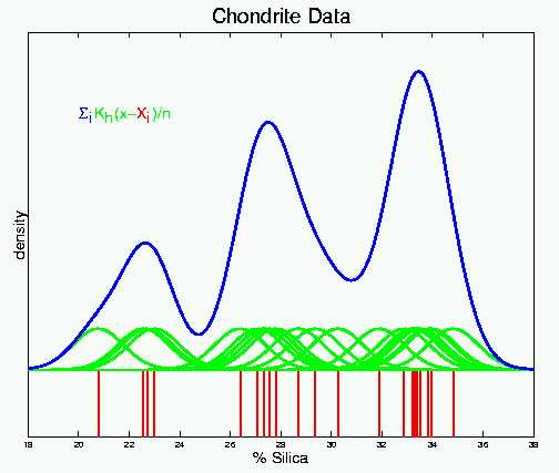
The blue curve is the sum of the kernel functions, and this now gives
a very strong suggestion of 3 modes in the Chondrite data, i.e. the Chondrites
appear to be coming from 3 astronomical sources. Of course there
is still a question of "are these modes really there?", as opposed to "could
they be explained by natrual variability?"
The bandwidth h has a much stronger effect on the resulting estimate (than the shape of the kernel K), so it's role is crucial in much of the following discussion. A cross-sectional view of the number of books on kernel smoothing reveals that kernel shape has been studied from a variety of viewpoints. The choice of "best" depends on one's choice of criteria. A point that is not widely understood is that for most types of theoretical comparison, the "canonical kernel" viewpoint of Marron and Nolan (1989) Statistics and Probability Letters, 7, 195-199 provides a simple and direct solution of the problem of the confounding between kernel and bandwidth.
My personal choice (others disagree, as they place different weights on the criteria involved) is the Gaussian kernel shape. One reason for this is the resulting kernel smoother looks smoothest at the microscopic level (other kernels can have some small "rough edges"). Another reason is the "modal monotonicity" property (the Gaussian is the only kernel where the number of modes always decreases as the bandwidth increases), discussed in detail in Section D. There was a time when a serious objection to the Gaussian kernel was computational speed. However, between the develoment of fast smoothing methods (see e.g. Fan and Marron (1994) Journal of Computational and Graphical Statistics, 3, 35-56), and the orders of magnitudes of speed improvement of our computers, this consideration no longer seems to be of practical importance.
During the analysis of the Hidalgo Stamps Data, in Section 1 above, it was remarked that the average of all of the shifted histograms is a kernel density estimator. This average is slightly from the smooth green curves shown because of the kernel shape. As noted in Section 5.3 of Scott (1982) Multivariate Density Estimation: Theory, Practice and Visualization, the average results in the triangular density as the kernel K. However, the green kernel density estimates use a Gaussian window.
While switching from the histogram to the kernel density estimate provides
a simple and direct solution to the "bin shift" problem, illustrated using
the Hidalgo Stamps Data in Section
1 above, it does not solve the "binwidth" or "bandwidth" problem.
This problem is illustrated, using the same data in the following plots.
This appears to be "undersmoothing". The bandwidth h
seems to be too small, so artifacts of the random sampling process strongly
appear. If it were possible to gather an independent set of data,
spikes of this type would appear, but in different (random) locations.
This could be the "right" amount of smoothing. Most analyses
of these data suggest the existence of 7 modes, which are clearly shown
here. This is also the bandwidth h that was chosen
by the "Sheather Jones Plug In" automatic choice of bandwidth. See
Sheather (1992) Computational Statistics, 7, 225-250 for this and
a number of interesting related examples.
This might be oversmoothing. Here the bandwidth h
has been deliberately chosen to produce only two modes. If the 7
modal opinions are correct, then a large amount of important structure
has been smoothed away by this bandwidth choice
Here is an even larger bandwidth, which now results in a unimodal estimate.
These are screen shots from the full movie
version of the family of smooths (indexed by the bandwidth), which is fun
to watch as a movie. A similar analysis of the Incomes data is available
from this movie.
This analysis does not allow a firm conclusion about the number of modes in the Hidalgo stamp data. However, we can conclude that the choice of bandwidth h is critical to the application of kernel density estimation. Also, it is again clear that a central data analytic question is:
Which features in the smooth are "really there", and which are sampling artifacts?
The classical approach to this problem is to attempt to use the data to find a "best" choice of h. Some pitfalls of this are discussed in Section C.
A newer idea (at least to theoreticians) is to include all levels of
smoothing in the data analysis. This is called the "family approach
to smoothing". It is the basis of SiZer, and is discussed in Section
4 below.
This method is illustrated using a data set kindly provided by Tim Bralower, UNC Department of Geological Sciences. The object of the study was global climate, on a time scale of millions of years ago. Information comes from cores drilled in the floor of the ocean. These cores contain small fossil shells, which can be dated by the surrounding material. An important measurement made on the shells is the ratio of the appearance of isotopes of Strontium. This ratio is believe to be driven by sea level. During an ice age, much of the oceans' water is frozen in the ice caps, so seawater has a more concentrated chemical content. As the climate warms, the chemicals become more dilute. The shells being studied absorb Strontium isotopes at different rates under these different conditions.
A simple and natural visual device for studying how the Strontium isotopes are absorbed at different rates is the scatterplot:
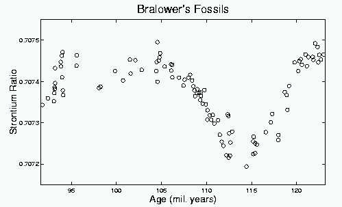
Bralower's Fossil Data, each circle is one fossil shell, its age in
millions of years on the horizontal axis, and the ratio of isotopes on
Strontium on the vertical axis. The Strontium ratios are all very
close (only differing in the 4th decimal place), but the scatterplot strongly
suggests this is not "random noise", but instead "important systematic
structure".
It is clear that the most common tool for scatterplot analysis, fitting a least squares line, would inappropriate here. The line would miss the important structure in the data (in the same that a histogram with too large a binwidth misses important structure). Extending the line to a quadratic will only help a little bit. A polynomial with sufficiently high degree will give a reasonable fit, but a degree that high in the present case leaves us in the domain of "smoothing".
As for kernel density estimation (discussed in Section 2 above), there are a number of good books on scatterplot smoothing (many books treat both topics). These books also present different viewpoints on what is the "best" smoothing method, etc. A personal summary of these viewpoints is in Marron (1996) in Statistical Theory and Computational Aspects of Smoothing, (eds. W. Härdle and M. Schimek), 1-9. The sound bite version is: "There are many good smoothing methods, with differing strengths and weaknesses. Differing personal views can be explained by different personal weights attached to these non-comparable factors."
My personal favorite smoothing method is local linear smoothing, using a Gaussian weight (i.e. window, i.e. kernel) function. This is the method that I first apply when a new data set appears in my office (e.g. the fossil data above). Local linear smoothing is not a new idea (see some nice references going back to the century before last in Cleveland and Loader (1996) in Statistical Theory and Computational Aspects of Smoothing, (eds. W. Härdle and M. Schimek), 10-49. However, at least for some of us, the ideas were not obvious, until they were pointed out in the papers of Cleveland (1979) Journal of the American Statistical Association, 74, 829-836, Fan (1992) Journal of the American Statistical Association, 87, 998-1004 and Fan (1993) Annals of Statistics, 21, 196-216.
A fun way to understand how local linear smoothing works, is via some movies, that can be found under item 1 on Marron's Movie Page. Here is a small part of one of those, that illustrates the main ideas:
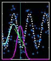
The white dashed curve represents a toy underlying regression curve.
The dark blue plusses are simulated data, whose local mean is the white
curve. The light blue curve is a local linear smooth. At a
given location (represented here by the thin vertical line) a "local line"
(represented by the green line) is fit to the dark blue data. This
fit is made local by using weighted least squares, based a set of Gaussian
kernel weights (represented by the purple Gaussian curve). Only the
point where the green line crosses the central vertical line is retained.
As the location (i.e. window center) is moved to the right, the light blue
smooth is traced out by this point. It is interesting to watch this
"tracing in action", which can be seen in the full movie
version. Many more such movies that illustrate various aspects
of local polynomial smoothing, plus links to a paper by Marron, Ruppert,
Smith and Conley, can be found here.
For the present discussion, the most important aspect of local linear smoothing is the width of the window (shown in purple). This has a profound impact on what is seen in the smooth, as illustrated here:
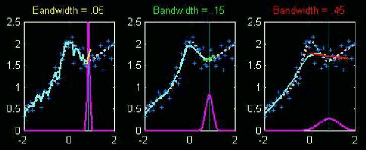
Again the white dashed is a toy underlying regression curve, the dark
blue plusses are corresponding simulated data, and the light blue curves
are local linear smooth, based on the purple Gaussian kernel weights.
The differences are the widths of the weight windows. In the left
hand plot, the window is quite small, which means that sampling variability
drives the local linear fit (note the unexpected angle of the yellow local
fit line), resulting in a wiggly light blue reconstruction. In the
right hand plot, the window is too wide, so the local fit is driven by
data too far from the location of interest, and thus misses important features
in the data. The center plot uses a window width that is in between,
so it feels only data nearby, yet is stable against the sampling variation.
The window widths shown here are closely related to the binwidth of the histogram (Section 1 above) and the bandwidth of the kernel density estimate (Section 2 above). In fact the same name "bandwidth" is commonly used. Again it is fun to watch the full movie version of these, and much more information can be found here.
Here is an application of the local linear smoothing method to the fossil data:
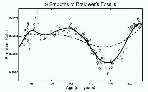
Here the fossil data, shown above, are overlaid with three (Gaussian
window shape) local linear smooths, using quite different bandwidths.
The small bandwidth smooth, shown as the dotted curve, is strongly affected by sampling variability. This is expected, as indicated above. A perhaps unexpected feature is that the smooth actually leaves the range of data. This is caused by data sparsity, i.e. time periods where few or no fossils are available. In particular, during time periods where there are essentially only two data points in the window, the line through them can be sent in unexpected directions. This happens in this case at around 97 (mil. years).
The large bandwidth smooth, shown as the dashed curve, misses some of the important features. For example much of the major dip, with a minimum around 114 (mil. years), is smoothed away. Again this is expected from the above ideas.
The moderate bandwidth smooth, follows the major dip very well, also it's shape suggests that it may be worth investigating some other features, such as the increase at the left edge, and the smaller dip near 99 (mil. years). Again we arrive at the central question:
Which features in the smooth are
"really there", and which are sampling artifacts?
Just as in Section 2 above, the classical
approach to this problem is to attempt to use the data to find a "best"
choice of h, i.e. to do "data driven bandwidth selection".
Some pitfalls of this are discussed in Section
C. Also a newer idea (at least to theoreticians) is to include
all levels of smoothing in the data analysis. This is called the
"family approach to smoothing". It is the basis of SiZer, and is
discussed in Section 4 below.
The traditional approach to statistical inference using smoothing methods is:
1. Choose a bandwidth (either by some data based method, or else according to the judgement of the data analyst).
2. Base inference on the chosen level of smoothing.
As discussed in Section C, there are some serious drawbacks to this. Perhaps the most serious of these are that there has never been a consensus among researchers on what is a "good" method of choosing a bandwidth, and most methods target criteria that are quite different from what is needed for the resulting inference.
The "family approach to smoothing" is a formalization of what good data analysts have been doing for some time: look at a number of smooths with different bandwidths. A difference is that instead of the more common sequential view, an overlay of the whole family is recommended. Here is the family for the Hidalgo Stamp Thicknesses:
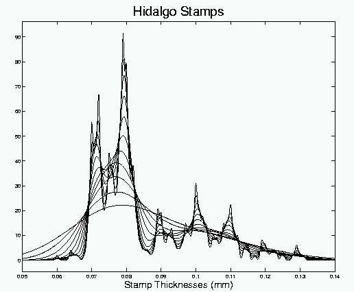
Note that this display gives immediate visual access to a very wide
range of features of the data (quite a contrast to the clumsy histograms
in Section 1 above). Quite apparent
are the two very strong modes at 0.072 and 0.08, and three medium modes
at 0.09, 0.10 and 0.11. Also apparent are some other interesting
suggestions of features, such as perhaps two smaller modes at 0.12 and
0.13, and maybe a thin mode between the too large one at 0.76. This
last feature may have been first pointed out by Minotte and Scott (1992)
Journal
of Computational and Graphical Statistics, 2, 51-68, and is
an excellent example of why it is very important to look at a range of
bandwidths (since it only appears at bandwidths that are typically considered
"too small").
While the family approach to smoothing makes a lot of information in the data available to the data analyst, it does not address the main problem discussed above:
Which features in the smooth are
"really there", and which are sampling artifacts?
This problem is addressed in the next section.
Such families of smooths have an interesting connection to "computer vision". The theoretical side of this area of computer science involves mathematical modelling of human vision. "Scale Space" is one of these models. See Lindebergh (1994) Scale Space Theory in Computer Vision for an excellent introduction. It turns out that scale space is a family of Gaussian kernel smooths, indexed by the bandwidth. Thus the above two "family plots" are also "scale space plots". The family of smooths models vision in the sense that large bandwidths correspond to stepping back and "looking macroscopically" only at coarse aspects of the big picture, while small bandwidths correspond to zooming in and "looking microscopically" at fine details. Much deeper discussion of the scale space view of smoothing, including some interesting facts that were well understood by scale space people long before they were known in the statistics community, is given in Section D.
For smoothing specialists, an interesting technical aspect of the family
approach to smoothing is the choice of the range of bandwidths to be displayed.
These issues are addressed by J. S. Marron and S. S. Chung (2001) (to appear
in Computational Statistics). It is seen there why a logarithmic
grid of bandwidths is important, and also some non-obvious rules for choosing
the endpoints of the grid are derived.
SiZer (Significance of Zero Crossings of the Derivative) can be viewed as adding statistical inference to the family of smooths discussed in Section 4 above. In particular it provides direct and immediate answer to the central question illustrated above:
Which features in the smooth are
"really there", and which are sampling artifacts?
The first hurdle to addressing this problem is: what are "features"?
An important type of feature is a "bump", which is simply characterized by the smooth going up on one side (of the bump), and coming down on the other. Attaching statistical significance to these ups and downs is the role of SiZer. When a bump is present, there is a zero-crossing in the derivative of the smooth. The bump is "statistically significant" when the that zero-crossing is significant.
Here is a SiZer analysis of the Hidalgo Stamp Thicknesses data.
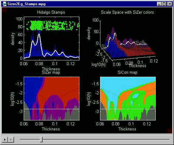
The upper left shows the family of smooths (as in Section
4 above), i.e. the scale space, overlaid this time in dark blue.
One member of the family is highlighted in white. The green dots
are a "jitter plot" of the raw data, i.e. the x coordinate shows
where the given datum lies on the number line, while the y coordinate
is just a random height which allows visual separation of the data (otherwise
they obscure each other). Note that the peaks in the highlighted
white smooth correspond to regions of greater density of the green dots.
The upper right plot shows a different view of the scale space. This is the surface that is generated when the curves in the family of smooths are "placed next to each other in bandwidth order". Thus a 3rd axis for "bandwidth" has been added. This view of the scale space is conceptually useful, although the overlay is preferable for data analysis purposes.
Next statistical inference is done on the derivative of the smooth. At each point in scale space (thus at each location, and also at each bandwidth), a confidence interval for the derivative is constructed. When that confidence interval is completely above 0, there is a statistically significant increase, and that location on the surface is shaded blue. Note that there is a lot of blue on the surface for the smaller stamp thicknesses, reflecting the increases in the density in those regions. When the confidence interval is completely above 0, there is a significant decrease, and the color red is used. This can be seen on the surface for many of the larger thicknesses, where the density is decreasing. When that confidence interval for the derivative contains 0, the intermediate color of purple is used. This coloring scheme allows finding "significant bumps", because there will be blue on the left side (where the curve increases), and red on the right side (as it decreases). On the other hand, bumps that are spurious sampling artifacts will be completely purple.
A weakness of using the colored scale space surface (upper right hand plot) for statistical inference is that not all parts of the surface are immediately visible. E.g. to assess the significance of the first mode, at thickness 0.072, we need to see whether some red color appears on the right side of the mode. Unfortunately this is not visible. The surface could be rotated, but is not clear in general how to provide good rotation defaults.
A more accessible view of the SiZer colors comes from the "SiZer map", shown in the lower left. This is the result of projecting the SiZer colors from the scale space surface onto the plane. Equivalently this is the "vertical view of the colored scale space surface". This map is placed immediately under the family surface to allow visual connection between their common x axes.
Here is what the SiZer map shows about the stamps data:
a. mode at thickness 0.072: this is "really there", because of the blue on the left and red on the right.
b. very large mode at thickness 0.08: this is "really there", because of the blue on the left and red on the right.
c. smaller mode at 0.09: here there is blue on the left (i.e. statistically significant increase), but no corresponding red on the right. Note that the white member of the family of smooths does not decrease so strongly here, and SiZer suggests that there is not enough evidence in the data to conclude that the density increases at that location.
d. smaller mode at thickness 0.10: this is "really there", because of the blue on the left and red on the right.
e. smaller mode at 0.11: this is the reverse of (c), there is a significant decrease, shown by the red on the right, but no significant increase on the left. Thus SiZer is unable to conclude that this "mode" is a strong feature of the data.
f. even smaller mode at 0.12: this is entirely in the purple
region. Thus SiZer indicates that the evidence in the data is not
strong enough to conclude that
there is a mode here.
Note that these features do not all show up exactly at the highlighted level of smoothing. In particular (a) appears at smaller window widths (lower down on the SiZer map), while (d) needs larger window widths (higher on the SiZer map). This shows why it is important to consider a range of bandwidths (i.e. levels of resolution of the data): important structure can appear at several different levels of smoothing.
There is one additional color in the SiZer map: gray. This is used in regions where the data are too sparse to do meaningful inference (i.e. there are not enough data points in the kernel window for reliable construction of the confidence intervals that SiZer is based upon). Here SiZer uses the simple Binomial rule of thumb "np > 5" to decide when conventional Gaussian theory Confidence Intervals are not valid, and thus use the gray color. See Section 3 of Chaudhuri and Marron (1999) Journal of the American Statistical Association, 94, 807-823 for full details.
An important technical issue is the "multiple comparisons problem". SiZer is based on a large number of simultaneous hypothesis tests. Even when the null hypothesis is true, about 5% of standard hypothesis tests are expected to (incorrectly) indicate a statistically significant result. As shown in Figure 3b of Chaudhuri and Marron (1999) Journal of the American Statistical Association, 94, 807-823, implementation of SiZer using naive pointwise intervals will result in incorrect inference. Hence, adjustment is needed to make the inference properly simultaneous. This is done via the notion of "Effective Sample Size", as discussed in Section 3 of that paper. Detailed discussion is given in Section B.
The lower right figure is a SiCon map (SIgnificant CONvexity). This is a variation of the SiZer map, where statistical inference is done on the 2nd derivative, not the 1st, i.e. the "regions of statistically significant slope" are replaced by "regions of statistically significant curvature". These are shown as:
cyan: significant concavity (downward
curvature)
orange: significant convexity (upward
curvature)
green: no significant curvature
Note that significant curvature shows up only at coarser levels of resolution (larger bandwidths). This is because the second derivative "feels sample noise more strongly", so that more smoothing is needed to obtain statistical significance. Here is the level of smoothing where the SiCon conclusions are perhaps the strongest.

Note that there is cyan at all of the
bumps (a), (b), (d) and (e) discussed above, suggesting that these features
are "really there". Also there is orange
(significant valleys) in between. This shows that SiCon can detect
structure that SiZer may not be able to find, which is why plotting both
maps can be quite useful. The bumps (c) and (f) however are not strong
enough to be distinguished from background noise. Observe also that
SiCon is using a different implicit definition of "feature" than SiZer.
For example, the first bump (a) hardly decreases on the the left side (note
there is no red at this scale in the SiZer
map), but the cyan color still appears because
SiCon only feels curvature, not slope.
A common question about the multiscale view afforded by SiZer and SiCon
is: at the end of the day which scale is "right"? In particular,
are there 4 statistically significant bumps, as suggested above, or are
there two, as suggested by this scale:
 ?
?
Or is there only one mode, as suggested by this scale:
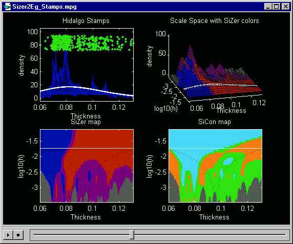 ?
?
The answer is that "all are correct", and simply represent different views (at differing "scales") of the data. From the very "macroscopic viewpoint" represented in the last plot, there is only one mode in this data set. From the slightly less macroscopic viewpoint shown just above, there are two modes. Zooming in for a closer look, 4 statistically significant modes become visible in the above plots. While these features are all visible in any family of smooths, the important contribution of SiZer is the indication that additional structure that will appear with further undersmoothing can not be distinguished from background sampling variability.
It is fun to watch the full movie version which can be easily (most
PCs currently come with a pre-loaded .mpeg viewer) downloaded here.
The highlighted white parts change in time (and can be conveniently selected,
using the .mpeg slider), which allows careful study of each different scale
(level of smoothing).
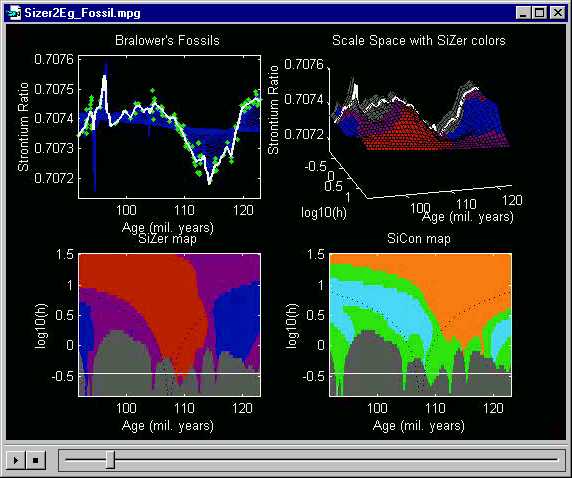
The Hidalgo Stamps data analyzed just above show the power of the SiZer method in the context of density estimation (histograms). The same ideas also apply in the closely related context of nonparametric regression (scatterplot smoothing). This is shown here using Bralower's Fossil data, from Section 3 above.
Recall that a central question there was: do all of the wiggles shown in the thick smooth curve represent statistically significant changes in global climate? A quick and direct answer to this question is provided by SiZer analysis:
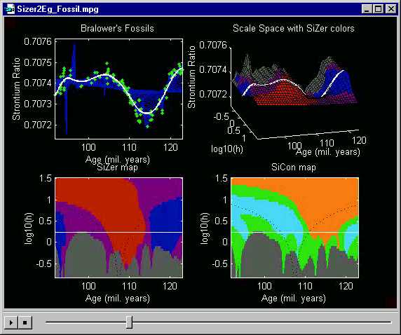
Note that the blue region on the far left
shows that the initial increase is significant. Also the red
from 106 to 114 million years ago shows that the major decrease in the
center is statistically significant. The major increase at the right
is also seen to be significant by the corresponding blue
region. Less clear was the smaller scale dip around 100 million years ago.
Note that this shows up in purple and even
gray
(indicating data sparsity) regions of the SiZer map. Hence, while
the smooth seductively suggests that this might be an important feature,
the SiZer map indicates that this could also be due simply to the natural
sampling fluctuations.
Other lessons observed above are similarly verified by the SiZer map.
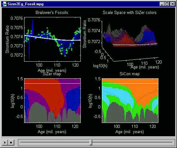
This undersmoothed curve shows almost no significant features (as expected,
since its ups and downs appear to be spurious sampling artifacts).
Much of the SiZer map is gray here, indicating
extreme data sparsity.
An interesting detail is the upwards spike at about 97 million years
ago. Note that at this point, the local linear smooth is actually
leaving the range of the data! This is caused by the window where
the local line is being fit containing essentially only two points.
Those two points happen to point the local least squares fit line upward,
and the resulting local linear smooth thus shoots far outside the range
of the data.
Here is the other extreme, of oversmoothing. This local linear
smooth appears to be similar to a least squares fit of a parabola to the
data. On the left side, the slope is steep enough that there is a
large statistically significant red region.
On the right side, the slope is not enough to be distinguished form background
noise, so purple appears.
The movie version of this SiZer analysis, from which the above plots
were made, is available here.
??? need to explain white and/or black dots and lines ???
Downloadable SiZer Software:
Matlab
6 Functions for SiZer and SSS (ascii)
For a Java version of SiZer (thus no Matlab required), go to Daniel
H. Wagner Associates, and follow the "Download SiZer software" link.
For more about SiZer, inquire by email from marron@stat.unc.edu.
Back to SiZer Main Page
Back to Data Analysis Table of Contents
Back to Marron's Home Page